To accomplish anything, we need a bit of motivation. Be it coming first in studies, or winning a competition, or succeeding in professional life. A trigger is needed to kick-start anything. Likewise, once your traffic finishes checking out your website, you must motivate or urge them to take action. And if you ask how, we have some stellar call to action examples, to make your audience engage and act.
Your target audience is bombarded with marketing messages every single day without fail. A steady flow of various digital contents overwhelms them. Often they find themselves at a loss as to what is expected of them or where to go next. Call to action buttons urge them to take real steps and guide them towards the sales funnel.
A compelling CTA phrase, proper positioning of the buttons, the color of the button, everything plays into the act of converting a lead into a paying customer. Since a call to action is an integral part of a marketing strategy, including it in website, email newsletter, videos and other marketing promotional materials, pays off in the long run.
These buttons bring an immediate response from the target audience. And it goes without saying that, no marketing strategy is a success unless a strong CTA is involved. All your marketing campaigns must have a well-crafted CTA phrase to drive a specific action. A persuasive CTA can take a user to a landing page, newsletter sign-up form, sales page or blogs, thus increasing the possibilities of revenue generation.
The Optimum Length of a CTA
Call to actions are trigger words that must never be too lengthy and boring. Short and crisp phrases do magic on the consumers’ psyche and pique their collective curiosity. But that said, a CTA does not have to be absurdly short, making no sense. CTA, can of course be longer than a sentence, as long as it makes proper sense and doesn’t stretch.
Clickable CTA buttons must be concise with smartly written phrases. The brevity and creativity of a CTA make it effective, so much so that it drives traffic and generates ROI.
The True Goal of an Effective CTA
Despite the rapid change in the platforms and channels used in marketing, the fundamental goal of CTAs has not undergone any change. Guiding the prospects to the conversion funnel. However, designing such effective CTAs is no doubt challenging. The task doesn’t end just by creating it. You need to make the CTA stand out.
The phrase you use must not be too salesy or aggressively pitching. Or the color you choose must not be too loud, as that will overwhelm the viewers. CTA buttons must a balance of everything that would prompt users to take a certain action. The onus of creating such power-boosting CTAs is on you, but to help you in the course, check out the click-worthy call to action examples we have, which are hard to resist.
1. Dropbox
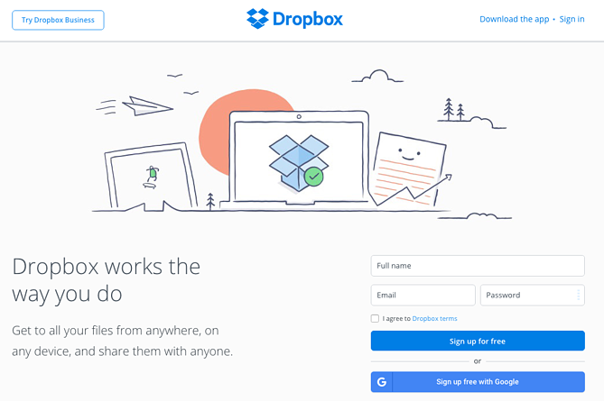
Dropbox has always been a little fond of white space and minimal graphics. And since it embraces a simple design approach, it becomes easier for a user to find the relevant resource. With a lot of negative space used up, the blue “Sign up for free” CTA button stands out exceptionally.
The subtle graphics on their homepage augments the CTA and lets the user take action without any ambiguity. Moreover, the color of the two buttons are is the same blue of the Dropbox logo; it effectively motivates anyone to sign up free for Dropbox.
2. WBUR
The bright red button at the top over their homepage not only stands out, but also is too convenient to be found. The button literally implores people to click on it and know more about their car donation program. This is a great way to make people participate and create an interest quotient.
This is the prime objective of any CTA. WBUR also has another equally persuasive CTA with a red heart that reads “Donate”. The implication of the heart symbol lies in being a human with a kind soul who donates for the poor.
3. Prezi
Prezi plays it in an intelligent way. The digital platform for animated presentation subtly showcases its USP by the tagline “What makes Prezi so unique”. This suggests the critical attribute that differentiates Prezi from any other digital content submission channel.
And then Prezi uses a brilliantly written line, “Words won’t do it justice. Neither will a simple video.” Simply put, Prezi establishes the fact that nothing can do justice or explain how great their product is. Instead, the prospects might try it for themselves to understand the difference. Once this message is conveyed, the “Try Prezi Next Free” CTA comes up.
Right from the start, Prezi makes a prospect ready for the product. By the time one comes to the CTA, they are quite mentally prepared to try the tool. The position of the button is perfectly measured, that makes it easy for interested individuals.
4. OfficeVibe
OfficeVibe utilizes calls to action in the best possible way. While scrolling down their blog posts, a user will be greeted with a short yet polite CTA button. The button is intended for subscribing to their blog. The copy of the OfficeVibe CTA banner usually imparts knowledge and other valuable resources.
This is where OfficeVibe stands out. Because most of the CTAs are about a sales pitch, but here one will get something they are interested in. The CTA button on this website isn’t over the top is a slide-in CTA that provides information while still allowing the reader to read the full blog post.

5. Digital Photography School
The CTA of this website is pretty straightforward with a primary question, a key takeaway and two clear options. The headline conveys a question urging the interest of the audience. And the immediate next tagline implies the benefit or value one will get by filling out the form.
And finally, two options come with “Let’s Go!” and “No Thanks” phrases. The yes option evokes a positive vibe, while the negative one gets lost into the rest of the image. This fine-drawn imagery draws our attention to the “Let’s Go!” option that seems to be more attractive, thanks to the exclamatory mark! Amongst some of the best call to action examples, this CTA easily steals the show!
When a CTA is clear and concise, it becomes easier for the audience to understand what is the intent behind the CTA. Too complex phrases perplex the prospects, thus putting them off.
6. NetflixNetflix
One of our primal fears is the commitment that comes with a hassle; especially when it is about signing up a service. There’s no guarantee whether one would like the service, or they would like to continue with it. And often canceling a subscription plan means too many phone calls and emails, thus jeopardizing the peace.
However, Netflix understands this fear of the prospects and handles it smartly. Just above the CTA “Join Free for a Month”, they have the copyright “Cancel anytime”, assuring the prospect. If you assure, you get clicks. If there’s no assurance or guarantee for the prospects, it is unlikely a CTA will be clicked so easily.
The call to action button also has its color matched with the logo of Netflix. This is another criteria that a marketer must take note of. The CTA buttons must be aligned with the brand identity of the brand it represents. It is a kind of professionalism that must be maintained.

7. Slack
When it comes to compelling storytelling through imageries, Slack nails it. The team collaboration platform emits a sense of togetherness and team value throughout its homepage. This value proposition attracts people as well as promotes Slack’s service. Both in image and text, one gets an idea of the motto that the website abides by.
The homepage has navigation menus such as Solutions, Resources, Pricing, Services. However, what captures a viewer’s gaze is the bright purple button on the right. This is an effortless design with an uncomplicated architecture, that first points out what the team collaboration software can do for them. And then compels the visitors to get started and find out the benefits of Slack in their business.
8. Evernote
The fantastic application software for note-taking, planning, and organizing – Evernote, has an excellent website design. The whole theme of Evernote is fascinatingly simple and does everything to make anyone figure out the services of the software.
The design on the homepage showcases the way Evernote can be used and what benefits the users will get. The moment the visitors land on the homepage, they get a sense of it. Also, the simple tagline “Remember Everything” is good enough that makes someone understand how Evernote can help them.
Then the main and the secondary CTA come that has a green color hue, the same as of the logo. A nice branding is done to trigger the psychology of the prospect. The quick benefits of leveraging the app and the signing up process to actually use it, all these key points are highlighted in the CTA. And these kinds of simple phrases all the more tickle the curiosity of anyone noticing them.
9. Shopify
Brevity is key. And when you are targeting your audience through mobile devices, anything lengthy is a strict no-no. Since most of the traffic these days come from mobile devices, it is always recommended to come up with marketing strategies targeted towards these devices.
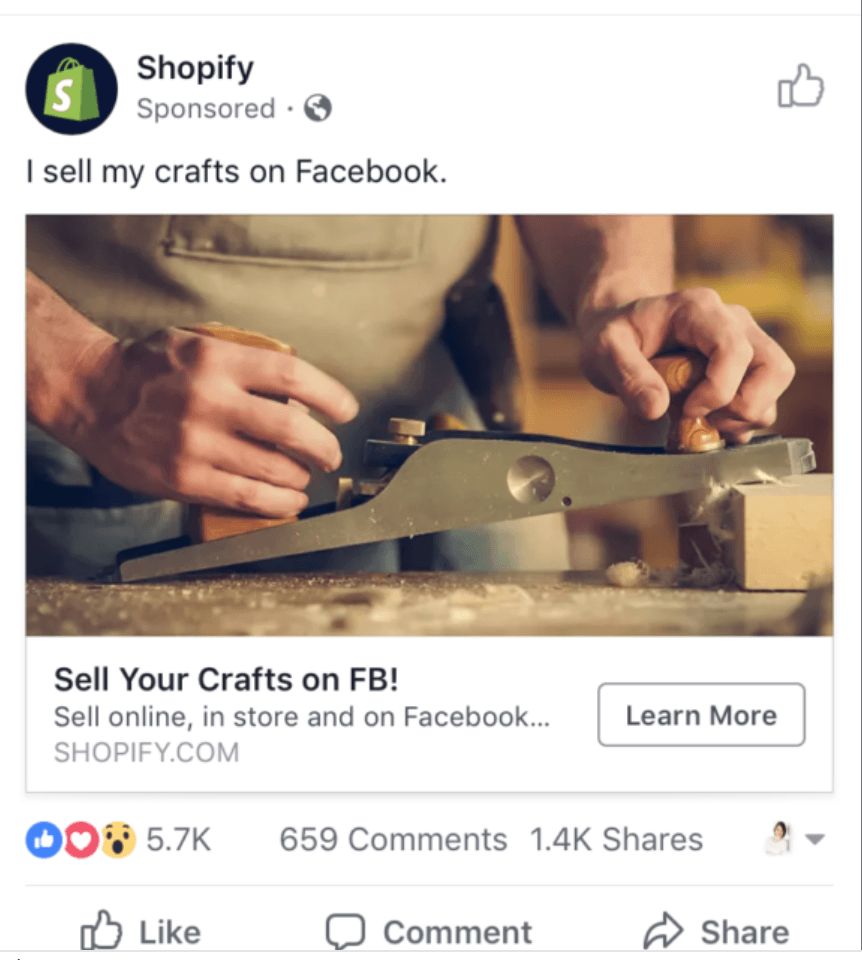
And for such devices, CTAs should also be crafted with enough skill. Shopify kills this with their ultra-concise call to action phrase, for the limited ad space in mobile. One of their Facebook ads just said “Sell Your Crafts on FB”, with a sub-tagline “Sell online, in-store, and on Facebook…”. Such effective call to action phrases motivates a user to take determined action.
These brief phrases are enough to initiate interest and works so well in a platform where brevity is a robust advantage. The ellipsis after the word “Facebook” follows right into the “Learn More” button, which is again too smart. It is like creating an interest and then leading someone’s eyes to a resource, where more of the object of interest has been elaborated. The clickable CTA button offers more to the audience when they are already intrigued.
10. Square
One of the most effective call to action best practices is to think beyond just the button. Though you have to place your call to action as a button but placing it strategically is more important. Just putting the buttons randomly won’t serve the purpose of engaging prospects. The surrounding texts and the background color, these must be taken into consideration.
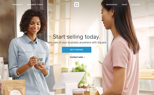
We can find all these areas covered in Square’s homepage. This online money transaction website uses a single image to showcase the simplicity of their products and services. Amidst the simple design, one will find the CTA “Get Started” floating in the middle, waiting to be clicked.
What more interesting is, the color of the CTA and the credit card that the woman in the image holds is the same. This sets the expectation of a visitor, as to what he/she will benefit from Square. Always be mindful of these additional elements, and call to action examples for sales if you want to augment the potentiality of your CTAs.
11. Lyft
The ride-hailing app plays it smart by offering a lucrative perk in their ad on social media. Lyft’s clever Facebook ad is one of the most noticeable social media call to action examples. That brings in new users and well as drivers, both. No wonder they tripled its active customers over a mere two years time span.
It is all about mastering the art of social media selling. And CTAs on social networks must be more attractive and engaging rather than on websites. Because your website will be visited mostly by the people who require your service. But on social media, your ad and call to action phrase will be seen by many.
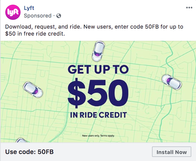
The more your ad floats on news feeds, the higher is the chance of your being noticed. Lyft places its ad with due diligence that talks about a promo code of $50. This is tempting no doubt! And at the beginning, in just three words, “Download, request and ride”, Lyft explains the process of availing the app. The code is laid out just below a graphic, showcasing an illustration of a navigation map and a few cars.
The offer is in prominent, bold and blue, easily noticeable by any. Flawless way of promoting your business. And just after the promo code, there’s the CTA “Install Now”. By the time the eyes of a visitor reaches here, he/she is already mentally ready to try the app out. The CTA button placed immediately after the promo code acts as a trigger, so that a user installs the app without a second thought. These kinds of examples are perfect for bringing in new customers, as well as retain the existing.
12. Full Bundle
The award-winning website design and development company in South England utilizes negative space in the most visually pleasing way. The homepage has a white CTA button that pops splendidly, against the dark gray background. The CTA reads “Our Work”, which is a nice way to showcase the portfolio.
Most people view a website to check the portfolio, that is required to make a decision. And Full Bundle ensures this point by placing the CTA right at the top section, that takes a person directly to their portfolio. These persuasive call to action keywords usher a user to a definite place, wherefrom the revenue generation process starts and the marketing team takes over.
13. Hulu
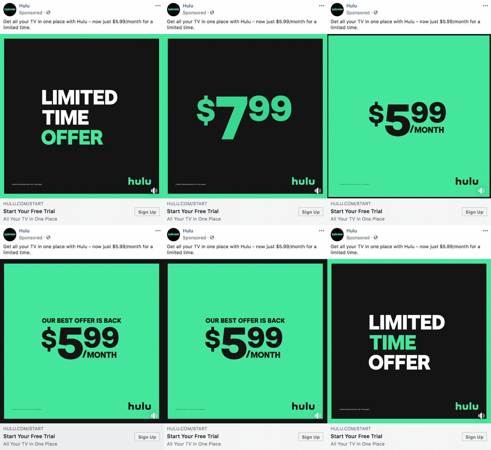
Another sturdy competitor of Netflix, Hulu uses a simple call to action which is apparently a simple GIF. But that is just one part of the story. The GIF ad copy itself acts as a CTA with smooth motion and bright colors. The slashed price stays highlighted for a few seconds. The content/copy used is mostly the colloquial ways we speak. Thus these call to action speech examples work perfectly online, giving the CTAs a personalized touch.
And just below the GIF image, that creates a sense of urgency, the sign-up button is laid out. This is a great way to create new subscribers. The GIF image talks about a limited-time offer, something that makes a prospect think about the time left. The person will find something immediately to try out the offer. And the strategic placement of the CTA button serves this purpose exactly.
14. Wix
The creative minds at Wix came up with a genuinely smart call to action that invites people to initiate something great for them. The call to action phrase “Get Started” is supported by the tagline “Create the Website You Want”. This is a great call to action in writing, that has a probability of encouraging someone to take action.
In no time, a person gets the urge of creating something, that may be an online/digital resume, online portfolio or a professional business website. That’s what Wix offers – a successful venture for the future, that is only one click away.

15. Instagram
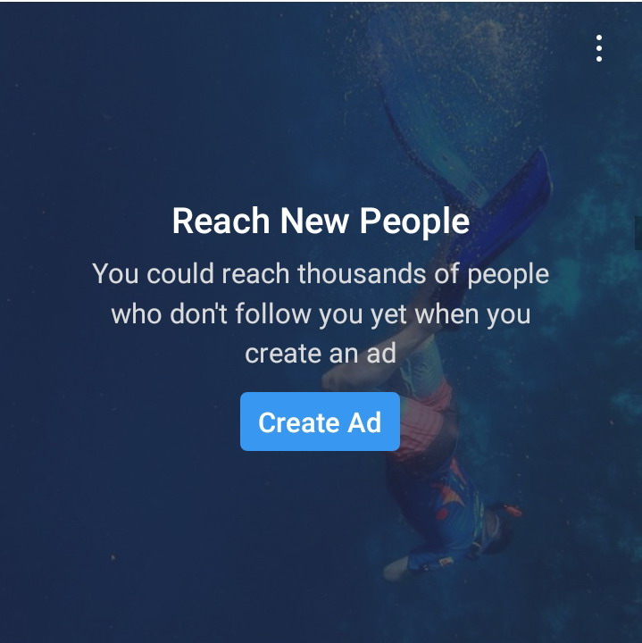
One of the ads of Instagram flaunts a very relevant call to action that draws in new advertisers who are interested in expanding their reach. This photo and video sharing platform with 1 Billion active users incorporates simplicity and brevity in its CTA. Their catchphrase is also quite appealing to the target audience, who understands the value of creating an ad.
A compelling Instagram ad can spearhead a business towards appreciable success. The enticing call to action phrase “Create Ad” is to the point and creates maximum effect.
Final Thoughts
Call-to-actions are hard to resist only when they encourage customers to take action. And the phrase for the buttons must entice visitors to click through. Making your CTA click-worthy is no rocket science, but just needs some smart strategies. The strategies must be properly aligned with the expectations of the visitors and give them a better idea.
This happens with experience and with much trial and error. Sometimes, people don’t even use any action verb, but still manage to urge visitors to click. However, if you offer them a reason to click, they will. There’s no scientific formula of creating the most click-worthy CTA, but yes, the call to action examples mentioned above, could be some ethical references one may follow.
For e.g., just how Starbucks did, using a bold and relevant CTA to make people curious and tempt them to try their new flavor. No one can refuse to stop in for a hot cuppa or an iced matcha green tea latte. These well crafted and click-worthy CTA examples prove that how they can breathe life to a campaign. One may use CTAs in any of kind of digital contents, right from Infographics, Animated videos or Social Media Graphics.
If you feel you are not receiving enough traffic or conversion that you used to or desired for, then think of tweaking your CTA buttons or phrases. Strong phrases, a bright color (aligned with your brand identity), strategical placement, easy navigation and minimal design – these are the vital components that yield a great click-worthy CTA that’s hard to resist.
You may try professional advice to make your website or marketing ads and promotional campaigns more substantial. Give your audience with CTAs that they cannot help, but click!
At A1 Future Technologies, we take pride in our decade long legacy of branding effectively for the success of our clients. With customized solutions and measures tailor made for exclusive client needs, our branding endeavors are ideal for online marketing of any or precinct. Hop into the bandwagon of constant growth with us by your side today.

