No, You Don’t Need to Be a Tech Geek
Accessibility. The word sounds big, intimidating, and complex, right? The kind of word that makes you think you’ll need a team of software engineers, a degree in coding, and a small team of consultants, just to understand it. But here’s the truth — it’s not that complicated.
Think of Accessibility as putting a welcome mat on your website’s doorstep. It’s about making sure that everyone can use your website with ease, regardless of ability. You don’t need to redo your entire site. You don’t need to empty your bank account. Sometimes, a few simple tweaks can make a world of difference.
Here are 5 easy ways to get started with Accessibility (easier than assembling IKEA furniture anyhow)
1. Add Alternative (Alt) Text to Your Images
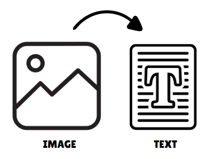
What It Is: Alt text is a short description of an image on a website that’s read aloud to visually impaired users by their screen readers.
Why It Matters: Imagine walking through a museum with blindfolds on, and instead of a guide explaining what’s in front of you, there’s just silence. No Explanations. That’s what it’s like for people with Visual Impairments trying to navigate image-heavy websites without alt text.
The Quick Fix: For every image on your site, add a short, clear description that explains the image.
Pro Tip: Avoid “Image of” or “Picture of” at the start. Jump right into the description. Your users don’t need a reminder that it’s an image.


Here’s what good alt text looks like:
❌ “image123.jpg” or “Image of pizza” — Boring, generic, and unhelpful.
✅ “Close-up shot of a fresh pepperoni pizza with bubbling cheese and crispy crust. Click here to view our pizza menu.” — Now THAT’S tasty (and Accessible).
2. Make Your Buttons Big, Bold, and Clickable
What It Is: Buttons are the “DO THIS NOW” signs on your website. But if they’re too small, too close together, or too hard to see, they’re basically “DO THIS NEVER” signs.
Why It Matters: Think of trying to tap a tiny button on your phone while riding a bumpy bus. That’s how it feels for people with Motor Impairments trying to click micro-buttons.

The Quick Fix:
- Increase the size of buttons
- Add more space between clickable elements
- Use high-contrast colors
Pro Tip: Want a universal guide? Make your buttons at least 48px by 48px. It’s the industry gold standard.
3. Don’t Just Rely on Color to Show Importance
What It Is: Color is often used to show important info, like “this button is green, so it’s good,” or “this message is red, so it’s urgent.”
Why It Matters: About 1 in 12 men and 1 in 200 women are colorblind. If you’re only using color to show meaning, you’re leaving them in the dark.
The Quick Fix:
- Use icons, text, or underlines to support color.]
- Add labels like “Error” or “Success” to alert messages
- Example: Instead of just using a red border around an error message, add a clear text label like “Error: Please enter a valid email address.”
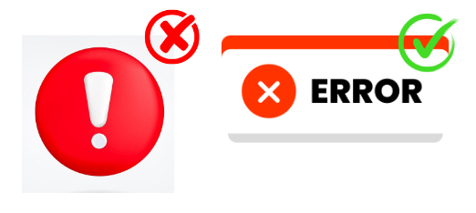
Pro Tip: Test your color choices with tools like Color Contrast Checkers. They’ll tell you if your red, green, and blue choices are friendly for users with color blindness
4. Caption Your Videos (Yes, Even the Funny Ones)
What It Is: Captions are on-screen text that reflects the spoken words and sounds in a video.
Why It Matters: Ever watched a movie on mute without subtitles? Illogical, right? For people with hearing difficulties, this is every single video on the internet.
The Quick Fix:
- Add captions to your videos. It’s easier than you think (YouTube has an automatic caption tool!).
- If you’re feeling fancy, add transcripts too. They’re great for SEO.
5. Add Keyboard Navigation (So People Can Ditch the Mouse)
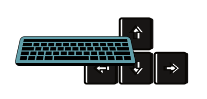
What It Is: Some users have difficulty using a mouse due to physical disabilities, so they rely on keyboards to navigate.
Why It Matters: Imagine browsing through your favorite site, but your mouse stops working. You’re left trying to “Key” your way around — and if the site isn’t keyboard-friendly, you’re stuck. That’s it for you.
The Quick Fix:
- Ensure all interactive elements (buttons, links, forms) can be accessed using keys on the keyboard.
- Add a visible “focus outline” that highlights where the user is on the page.
Example: Try using only the keyboard on your own website. Can you “Key” through every button, menu, and link? If not, time to fix it.
Bonus Tip: Don’t Do It Alone

Feeling overwhelmed? You’re not alone. Accessibility is a process, not a one-and-done task. And the good news is, you don’t have to do it solo. Accessibility audits and support teams exist to make it easier (hey, we know a great one — wink wink).
If you’re looking for expert help, get in touch with A1 Future Technologies. Our team offers free Accessibility Audits to spot issues and guide you to a more accessible website.
Conclusion: Start Small, Win Big
Accessibility doesn’t have to be hard. With these 5 quick fixes, your website becomes way more Accessible than before. And let’s be honest — when you make things easier, you’re making it better for everyone.
So go ahead, add that alt text, enlarge those buttons, and turn your website into a place where everyone’s welcome. Your future customers (and Google’s search rankings) will thank you.
Want more tips or a free accessibility audit? Get in touch with us at A1 Future Technologies and let’s make the web a friendlier place together.

